Content Manager Documentation
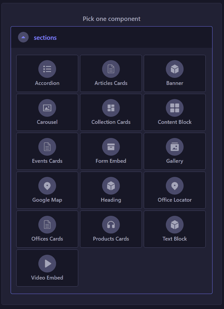
This documentation showcases each component and the varieties that it’s able to achieve. Every component has its settings (colours, themes, font size, etc) that could be adjusted according to your needs.
P.S. Any theme that are not mentioned in this documentation is currently unused, unless they’re needed for future improvements. Choosing these themes won’t break the page - just produces plain style.
Banners - Accent
Banner - Secondary
This is banner - theme 1.
Remember that even after you choose a theme, you can still style any banner sub-items (paragraph, buttons, background) however you need it to be, with the size and colors provided.
Banner - Tertiary
This is banner - theme 1 with background color set to None.
Not recommended to add buttons on the tertiary background due to the color contrast.
Banner - Theme 2
Most of the content in this banner is bolded, including unordered list items, which are also styled with a fixed white color
- List 1
- List 2
- List 3
Banner - Theme 3
This is banner - theme 3. This one also has 50% width in bigger screen. The difference with the theme 2 is that this one does not provide bottom divider.
Lorem ipsum dolor sit amet, consectetur adipiscing elit, sed do eiusmod tempor incididunt ut labore et dolore magna aliqua. Ut enim ad minim veniam, quis nostrud exercitation ullamco laboris nisi ut aliquip ex ea commodo consequat.
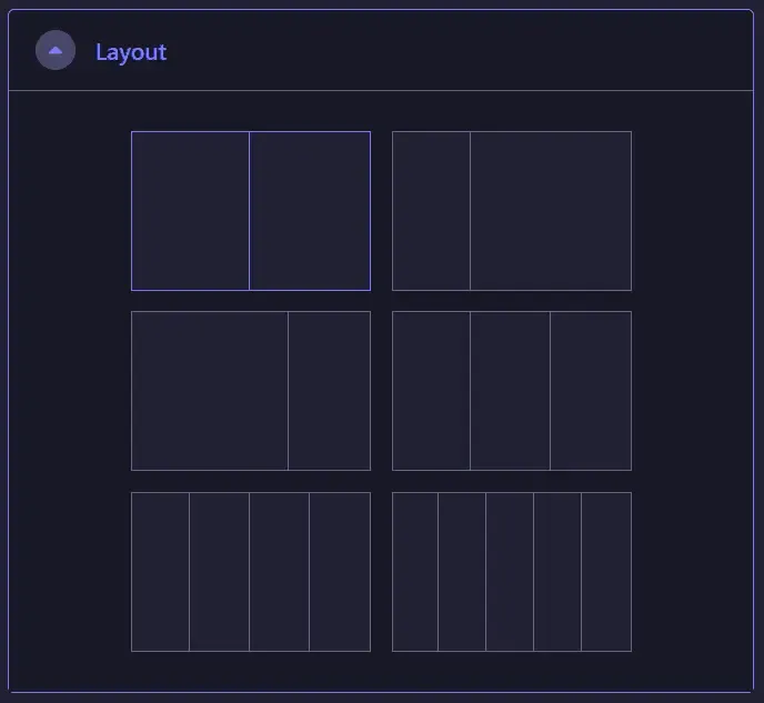
Content Blocks
Content Block - Theme 1
This is Content Block - Theme 1.
Content blocks are essentially contents in columnal layout. You can choose from two up to 5 columns, and all of them can be styled with any theme that you need. For example, this is theme 1.
Content Block - Theme 2

This is content block theme 2.
- Has narrower gaps from each column and to each item in the column
- Has wider gap to the section before and after
- Recommended to add column background color; it’s styled to have rounded corners
Please refer to other themes as a comparison.
Content Block - Theme 2
This is content block theme 2.
- Has narrower gaps from each column and to each item in the column
- Has wider gap to the section before and after
- Recommended to add column background color; it’s styled to have rounded corners
Please refer to other themes as a comparison.
Content Block - Theme 2
This is content block theme 2.
- Has narrower gaps from each column and to each item in the column
- Has wider gap to the section before and after
- Recommended to add column background color; it’s styled to have rounded corners
Please refer to other themes as a comparison.
Content Block - Theme 3
Theme 3 used 1-2-layout content block; 20% for image on the left - 80% for content on the right (only cater to 2-layout contentblock with a 1:2 ratio)
Add accent underline on heading links while on hover

Theme 4

Theme 4

Theme 4
This is content block theme 4.
- Recommended to add column background color; it’s styled to have rounded corners (border style, not filled)
- Image will animate on hover when there’s link associated to it
This is content block theme 4.
- Recommended to add column background color; it’s styled to have rounded corners (border style, not filled)
- Image will animate on hover when there’s link associated to it
This is content block theme 4.
- Recommended to add column background color; it’s styled to have rounded corners (border style, not filled)
- Image will animate on hover when there’s link associated to it

Lorem ipsum dolor sit amet, consectetur adipiscing elit. Sed et orci sit amet sapien elementum suscipit vitae sed massa.
Lorem ipsum dolor sit amet, consectetur adipiscing elit. Sed et orci sit amet sapien elementum suscipit vitae sed massa.
Video in Content Block
Video in Content Block
Video in Content Block
Buttons
Buttons - Small Size
Buttons - Medium Size
Buttons - Large Size
Typography
Primary Color
Heading Extra Small
Heading Small
Heading Medium
Heading Large
Heading Extra Large
Secondary Color
Heading Extra Small
Heading Small
Heading Medium
Heading Large
Heading Extra Large
Accent Color
Heading Extra Small
Heading Small
Heading Medium
Heading Large
Heading Extra Large
And this is how a regular paragraph looks like. You can also adjust the sizing and the colors too, just like the heading ones.
This is extra-small size, accent color
This is small size, primary color
This is medium size, secondary color
This is large size, accent color
This is extra-large size, primary color
Accordion
Ut enim ad minim veniam, quis nostrud exercitation ullamco laboris nisi ut aliquip ex ea commodo consequat.
- Sed ut perspiciatis unde omnis iste natus error sit voluptatem accusantium doloremque laudantium
- Totam rem aperiam, eaque ipsa quae ab illo inventore veritatis
- Et quasi architecto beatae vitae dicta sunt explicabo
Quis autem vel eum iure reprehenderit qui in ea voluptate velit esse quam nihil molestiae consequatur, vel illum qui dolorem eum fugiat quo voluptas nulla pariatur
- Nemo enim ipsam voluptatem quia voluptas sit aspernatur aut odit aut fugit, sed quia consequuntur magni dolores eos qui ratione voluptatem sequi nesciunt.
- Neque porro quisquam est, qui dolorem ipsum quia dolor sit amet, consectetur, adipisci velit, sed quia non numquam eius modi tempora incidunt ut labore et dolore magnam aliquam quaerat voluptatem.
- Ut enim ad minima veniam, quis nostrum exercitationem ullam corporis suscipit laboriosam, nisi ut aliquid ex ea commodi.
Totam rem aperiam, eaque ipsa quae ab illo inventore veritatis
Quis autem vel eum iure reprehenderit qui in ea voluptate velit esse quam nihil molestiae consequatur, vel illum qui dolorem eum fugiat quo voluptas nulla pariatur
Yes you can. Just toggle to the “columns” option and choose “two”. Voila!
- Blanditiis praesentium voluptatum deleniti atque corrupti quos dolores et quas molestias
- Excepturi sint occaecati cupiditate non provident, similique sunt in culpa qui officia deserunt mollitia animi
- Id est laborum et dolorum fuga. Et harum quidem rerum facilis est et expedita distinctio
- Nam libero tempore, cum soluta nobis est eligendi optio cumque nihil
- Impedit quo minus id quod maxime placeat facere
Lorem ipsum dolor sit amet, consectetur adipiscing elit, sed do eiusmod tempor incididunt ut labore et dolore magna aliqua. Ut enim ad minim veniam, quis nostrud exercitation ullamco laboris nisi ut aliquip ex ea commodo consequat.
Duis aute irure dolor in reprehenderit in voluptate velit esse cillum dolore eu fugiat nulla pariatur. Excepteur sint occaecat cupidatat non proident, sunt in culpa qui officia deserunt mollit anim id est laborum.
Ut enim ad minim veniam, quis nostrud exercitation ullamco laboris nisi ut aliquip ex ea commodo consequat.
- Sed ut perspiciatis unde omnis iste natus error sit voluptatem accusantium doloremque laudantium
- Totam rem aperiam, eaque ipsa quae ab illo inventore veritatis
- Et quasi architecto beatae vitae dicta sunt explicabo
Quis autem vel eum iure reprehenderit qui in ea voluptate velit esse quam nihil molestiae consequatur, vel illum qui dolorem eum fugiat quo voluptas nulla pariatur.
- Nemo enim ipsam voluptatem quia voluptas sit aspernatur aut odit aut fugit, sed quia consequuntur magni dolores eos qui ratione voluptatem sequi nesciunt.
- Neque porro quisquam est, qui dolorem ipsum quia dolor sit amet, consectetur, adipisci velit, sed quia non numquam eius modi tempora incidunt ut labore et dolore magnam aliquam quaerat voluptatem.
- Ut enim ad minima veniam, quis nostrum exercitationem ullam corporis suscipit laboriosam, nisi ut aliquid ex ea commodi.
Totam rem aperiam, eaque ipsa quae ab illo inventore veritatis
Quis autem vel eum iure reprehenderit qui in ea voluptate velit esse quam nihil molestiae consequatur, vel illum qui dolorem eum fugiat quo voluptas nulla pariatur